How to Tell Whether an Affordable Small Business Website Is Actually Good
A polished design is only the starting point. Use these practical pass/fail checks to review business copy, mobile navigation, contact forms, accessibility basics, and loading before approving a website rebuild.
 By Flaria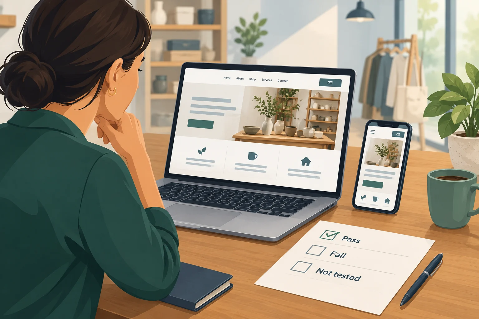
A good small business website makes it easy to understand your services, move around the pages, read the content, and contact you. Judge an affordable rebuild by those tasks—not whether it looks expensive.
Use three review labels: Pass, Fail, and Not tested. A feature that has not been tested has not passed. Apply the same checklist whether you build the site yourself or hire a freelancer, agency, or managed service. Treat it as an approval tool, not a promise of more sales.
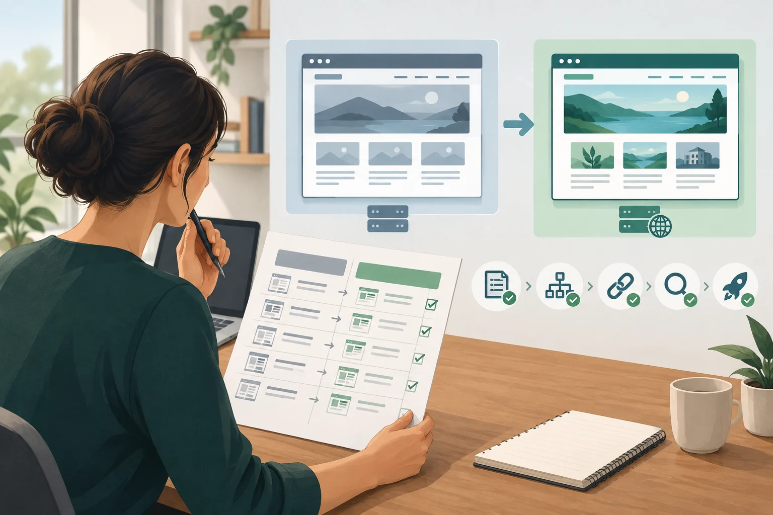
Know what you are approving: mockup, preview, or launch-ready website
Use these working definitions when agreeing what your approval means:
- Visual mockup: Approve proposed appearance and wording only. Do not count pictured menus, buttons, or forms as evidence that their implemented versions work.
- Preview: Ask which pages and functions are implemented and which connections remain unfinished. Test the available features, but mark anything missing or simulated as Not tested.
- Launch-ready result: Require the agreed pages and functions to be complete, configured for their intended use, and free of unresolved review failures. Identify any checks that must happen on the final domain, with a responsible person and retest time.
State exactly what you approve: the visual direction, particular pages, or the finished website. Do not let approval of one stage silently become approval of everything.
Check whether the copy is useful—and the claims are genuine
Read the homepage and one important service page. Can you identify the service, intended customers, service area, and next step without guessing? Ask someone unfamiliar with the business to try the same exercise.
Pass: They can explain what you offer and how to inquire. Fail: They encounter generic slogans, contradictory locations, or no clear description of the work.
Illustrative example—fictional business: “Interior painting for homeowners in Columbus, Ohio. Tell us which rooms you want painted to request an estimate.” This supplies an offer, audience, area, and next step without inventing an award or turnaround promise.
Next, compare services, hours, credentials, photos, and testimonials against your records or original material. Confirm that photos are represented honestly. Fail an untraceable testimonial, unsupported credential, or availability promise you cannot honor. Do not approve wording merely because it sounds persuasive.
Try the mobile menu, contact buttons, and entire inquiry process
On a real phone, open and close the menu, reach a service page, and return to the homepage. Try this without help from the builder. Pass only if the route works and labels make sense. Fail overlapping controls, clipped paragraphs, or ordinary text that requires sideways scrolling.
Then check the complete contact path:
- Check destinations. Tap each prominent call, email, and inquiry action. Verify the number, address, or destination—not just the button label. Check repeated buttons on service pages too.
- Check receipt. Submit a clearly labeled test inquiry using nonsensitive details and a contact address you control. Confirm that the intended business inbox receives the expected name, contact information, and message.
- Check feedback. Separately, leave a required field empty and submit. Pass if the form identifies the problem and explains how to correct it.
W3C recommends clear feedback for successful submissions and errors. Use its form-notification guidance when requesting corrections.
Do not pass delivery based only on a thank-you screen. If receipt cannot yet be demonstrated, leave that check unresolved.
Check keyboard use, image alternatives, and readable text
Keyboard operation and visible focus
On a computer with keyboard navigation enabled, put the mouse aside. Use Tab and Shift+Tab to move through links, menu controls, and form fields. Ask the builder to demonstrate the appropriate activation keys for unfamiliar controls.
A visible focus indicator identifies the control currently selected for keyboard use. Following W3C's preliminary accessibility checks, pass only if you can see that indicator, move in a sensible order, operate the controls, and leave each one. Fail disappearing focus, unreachable menus, or a control that traps keyboard navigation.
Appropriate image alternatives
Ask the builder to demonstrate the implemented text alternatives using W3C's informative-image guidance. Informative images need text alternatives that communicate their purpose; decorative or redundant images should not receive unnecessary descriptions.
Pass when the builder can show how important image information is conveyed and explain how decorative images are handled. Fail an informative image whose alternative is just a filename, unrelated wording, or missing important meaning. Do not mark this passed solely from looking at the picture.
Readable text
Set browser zoom to 200% and inspect paragraphs, headings, field labels, and buttons. Pass if content and controls remain usable without overlapping or disappearing.
Ask the builder to measure text contrast against WCAG 2.2. WCAG generally specifies text contrast of at least 4.5:1 for normal text and 3:1 for qualifying large text, with exceptions. Ask the builder to identify the applicable category and any exceptions. Do not accept “it looks readable” as the measurement.
Passing preliminary checks can still leave significant accessibility barriers. W3C's Easy Checks guidance makes that limitation clear. Treat this worksheet as a first review, not an accessibility compliance guarantee; request a more comprehensive assessment when needed.
Judge loading by what visitors experience, not one score
Open the homepage, a service page, and the contact page on your phone using an everyday connection. Try cellular service as well as Wi-Fi. Watch for useful content appearing, controls responding, and page movement interrupting reading or tapping. Record repeatable delays and moving buttons rather than choosing an arbitrary universal time limit.
Core Web Vitals cover loading, responsiveness, and visual stability. Laboratory measurements do not replace real-user measurements. Google's Web Vitals guide explains the distinction.
If the builder supplies a performance report, ask which pages, devices, and connection conditions it covers, and whether it reflects lab tests or real users. Do not use one score as the whole quality verdict. Mark a repeatable delay that prevents an important task as a failure requiring investigation.
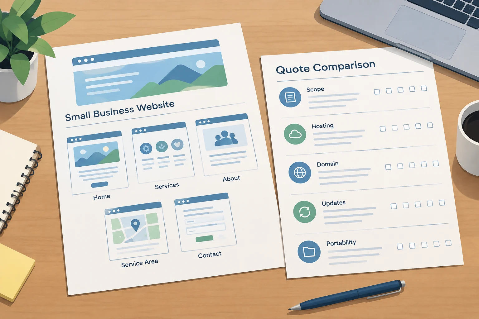
Use this website approval worksheet
For each row, record Pass, Fail, or Not tested and the affected page. Use separate entries where results differ between pages or devices.
| Check | Observable pass condition | Status and page |
|---|---|---|
| Clear service copy | Service, audience, area, and next step are identifiable. | ___ / ___ |
| Genuine business claims | Details and claims match records or original material. | ___ / ___ |
| Mobile navigation | Menu and return route work; ordinary text fits. | ___ / ___ |
| Contact destinations | Call, email, and inquiry actions reach intended destinations. | ___ / ___ |
| Form receipt and feedback | Test reaches inbox; success and correction messages are clear. | ___ / ___ |
| Keyboard operation and focus | Controls work in sensible order with visible focus and no trap. | ___ / ___ |
| Image alternatives | Builder demonstrates meaningful alternatives and appropriate decorative handling. | ___ / ___ |
| Readable text | 200% zoom remains usable; applicable contrast checks are documented. | ___ / ___ |
| Loading experience | Content, response, and movement allow important tasks without disruption. | ___ / ___ |
Issue record: Page: ___; device: ___; action: ___; observed problem: ___; person responsible: ___; retest result: ___.
Before final approval, ask for corrections to failed items and demonstrations for untested ones. Separate optional style preferences from problems that block understanding, operation, or contact. Retest corrected items and repeat any launch-dependent checks on the live website. Keep the completed worksheet with your approval notes so everyone knows what was accepted and what remains open.
Considering a managed rebuild? Explore Flaria's managed small business website rebuild and use this checklist when reviewing the result.
Sources & further reading
Flaria helps U.S. small businesses rebuild outdated websites with AI-assisted production and review by Flaria’s team. Our guides explain the decisions behind a practical, affordable website.